Phone Number
Redesigns, Launches & Coaching
Your Custom Text Here
Your Custom Text Here
I was hired in early 2013 by new owner Jay Penske to re-imagine the entertainment trade paper Variety as a weekly magazine. A strong, newsy type palette and heavily templated design system helped draw a clear line in the sand between the newsroom's authoritative, business-first focus and the competition's more elegant, lifestyle-focused content (for which I played a key role in creating back in 2010). A year later — and after 7 straight years of decline — print ad revenue was up 10%
Intel illustration by Ben Wiseman. Bloomberg photograph by Francois Dischinger.
Feature opener. Illustration by Ben Wiseman
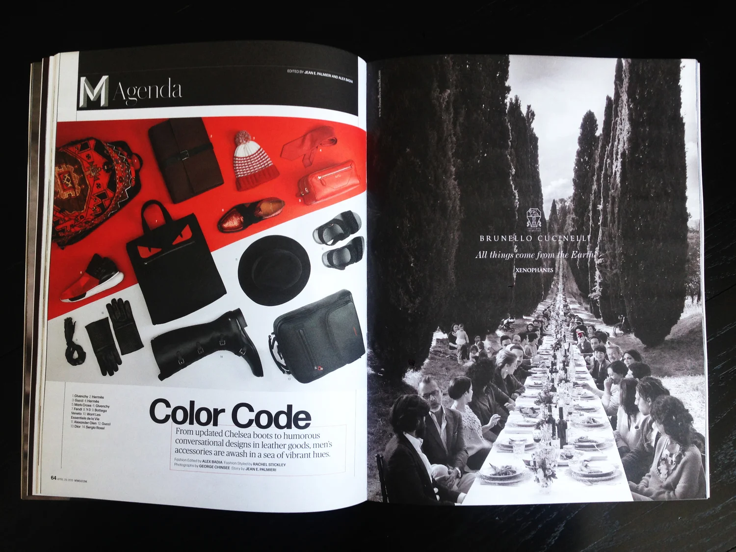
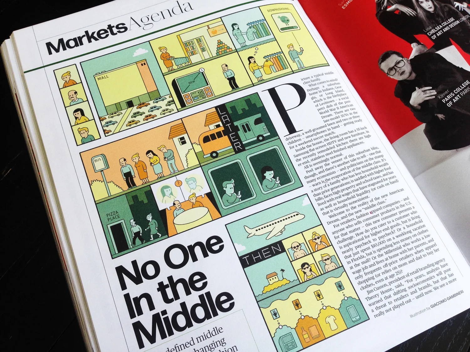
The front-of-book section begins with a mix of news modules recapping the week's top deals and castings, anchored by a timely news item explained by chart or infographic.
Commercial Type's bold and energetic Duplicate Slab was carefully chosen to anchor Variety's news content, in contrast to the competition's more elegant and passive palette.
Jim Parkinson was hired to clean up the 100+ year-old logo while retaining its core personality. The scale, spacing, tilt, swashes and serifs of the individual letters were all refined to work and read better both individually, and as a whole.
Relativity's Ryan Kavanaugh as Willy Loman, above.
The section of box-office and television charts begins with a right-hand opener anchored by a data-rich chart or graphic.
Mayor Bloomberg, photographed by Francois Dischinger
Party pages section opener
Spotlight content is grouped by event or achievement, flagged by icons created by La Tigre.
Final Cut, the back-of-book section, opens with film or television reviews
Corporate Forensics
A recap of the week's biggest stories posted to Variety.com
Glossary, set in the style of type foundry specimen sheet
Original design for news briefs at relaunch, The Paper was printed on an uncoated sheet using classic newspaper typography and referencing Variety's past daily editions layout.
Creative Director Shanti Marlar asked me to direct this supplement to to The Hollywood Reporter 4 years after leading the redesign effort of the weekly magazine in 2010 for Razorfish. Given less than two weeks to complete, the design references the Reporter's smart sophistication while appearing more masculine and direct.
A looser, more spacious structure — featuring heavier weights of Commercial Type's Brunel for headlines and a bold reinterpretation of the Reporter's interlocking/bracketed page frame — moves Watches closer to the enthusiast category than its industry trade parent.
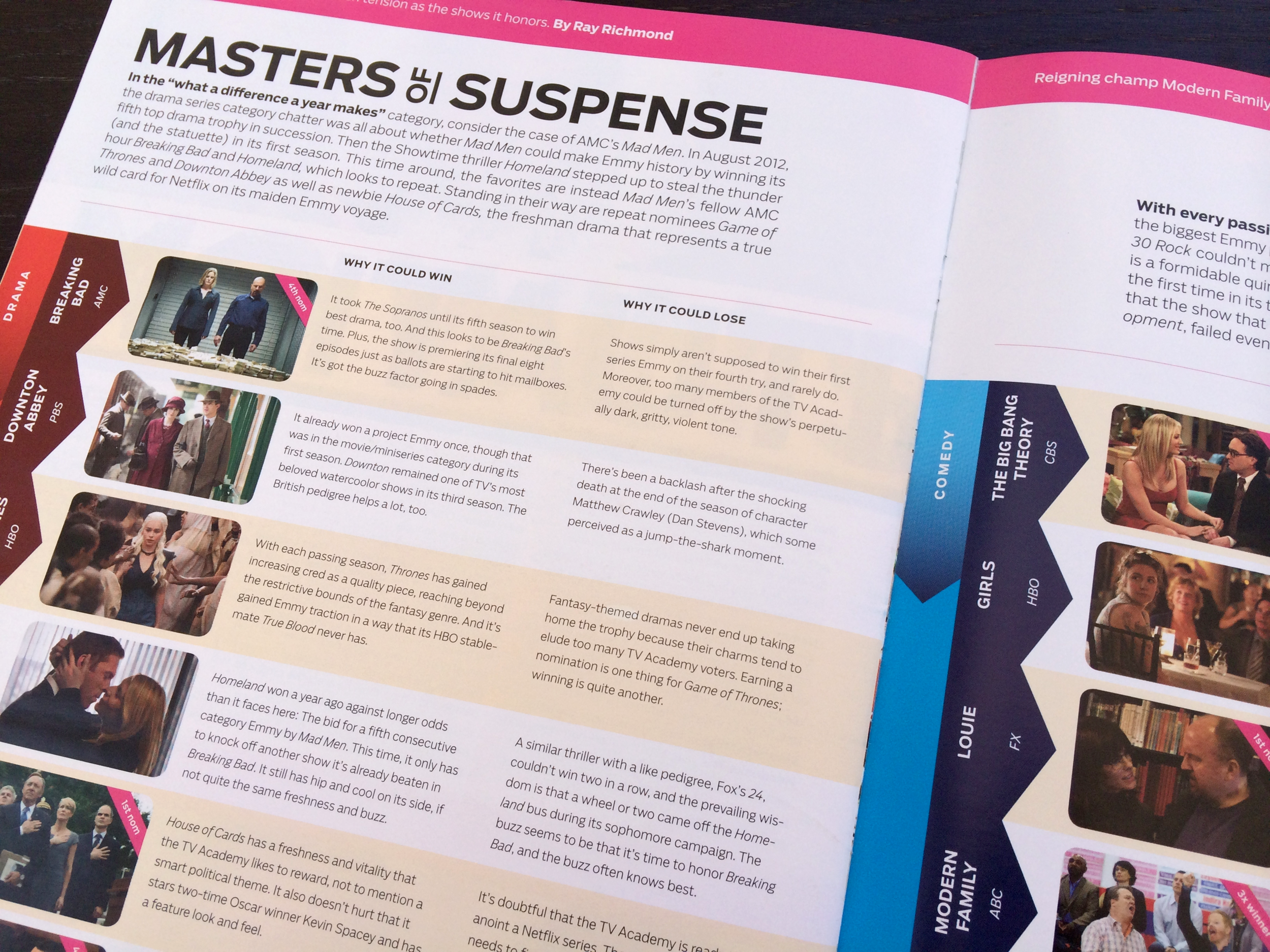
Published weekly during awards-season (Emmy/Oscar) and delivered directly to an in-the-know audience of guild members, AwardsLine enthusiastically cover the races from an insiders perspective. The new design reflects this close relationship by replacing the glamour normally associated with Hollywood, with a fun, casual and approachable visual aesthetic.
What Makes An Oscar Worthy Performance? Iconic scenes from past winners (Jack Nicholson in One Flew Over the Cuckoo's Nest above) were sprinkled between the 2014 contenders to add a historical angle and visual layers to the story.
Director Ryan Murphy (HBO's The Normal Heart), photographed by J.R. Mankoff for The Dialogue, AwardsLine's 8-12 page interview section.
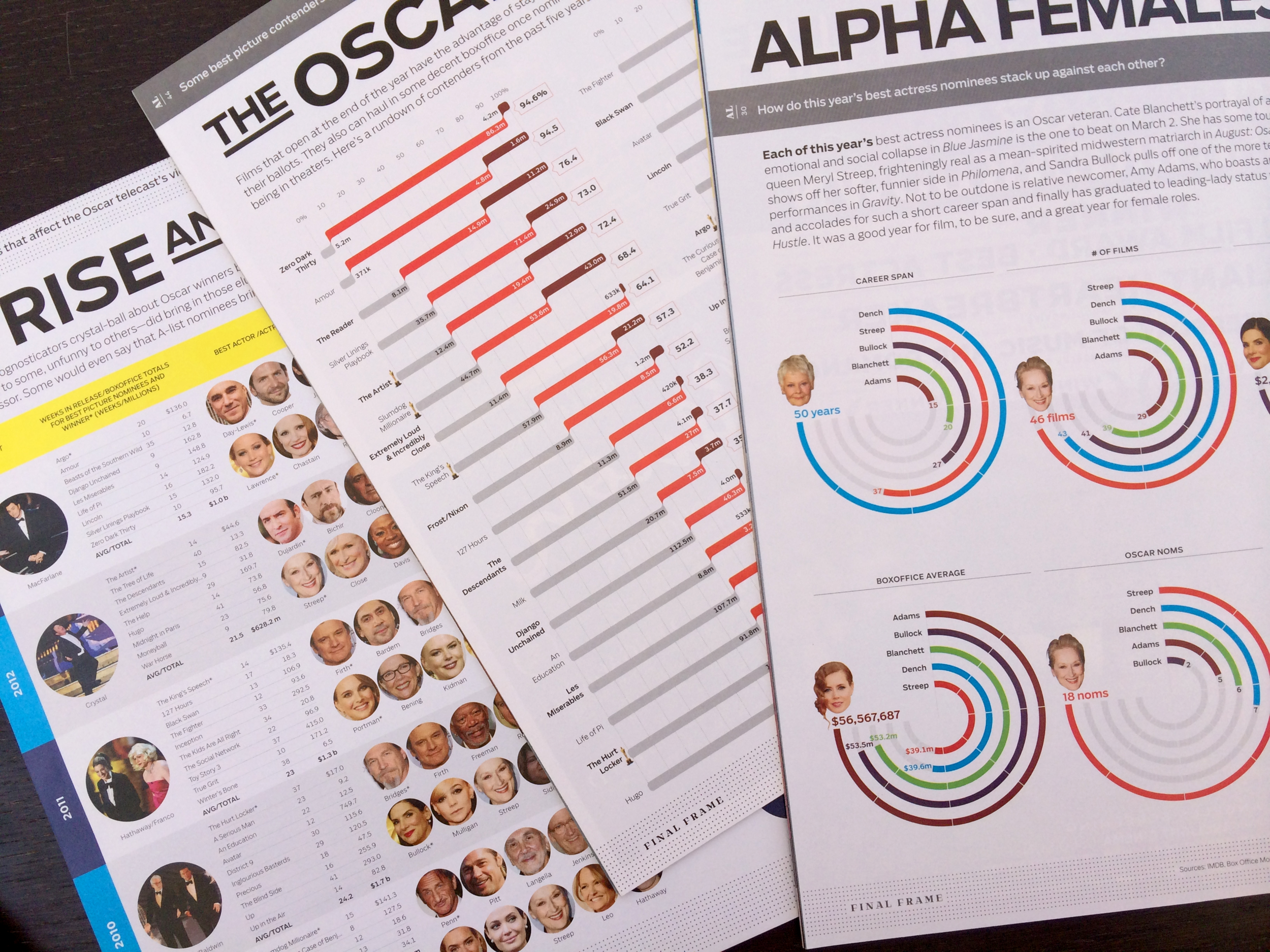
Best Picture handicap
House of Cards show runner Beau Willimon, photographed by Mark Mann.
Two evenings to create, and it contains a mistake . . .
Buenos Aires-based illustrator Costhanzo brings humor and visual variety to the magazine with his illustrations.
Emmy host Neil Patrick Harris photographed by Aaron Fallon
Every issue ends with Final Frame, a data-rich, info-graphic driven back page. (A time-consuming, labor of love for our 2-man team).
Each issue begins with First Take: a full spread, behind-the-scenes photograph from an award contending film or show (12 Years A Slave above)
Sketch from initial design presentation
Sketch from initial design presentation