In addition to the weekly magazine, Variety publishes daily editions during Emmy and Oscar season — a potentially confusing array of products for readers given the trade's recent history as a daily and the pervasiveness of false ad covers that obscure both graphic and editorial cues to each new issue.
My solution was to create a design and editorial structure that was unique enough to avoid confusion with the weekly, yet familiar enough that readers would immediately be comfortable navigating its pages.
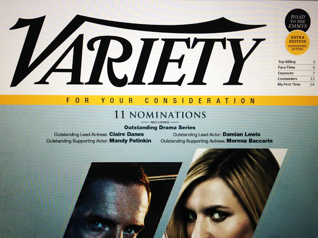
The final cover sketch for the daily editions. Editorial space was carved out above the advertising and to the right of the logo to clearly label the edition, tease the content inside and differentiate between the weekly magazine.

To signal 'soft news' and to help avoid confusion with the weekly magazine, the daily edition features large folios positioned in a more spacious top margin, a bright blue color used behind captions and pull quotes, and a different display and text style of Commercial Type's Duplicate family (Ionic).

The page architecture of the daily edition is largely based on a rejected sketch from the Variety redesign project in 2013. Screenshots of those sketches can be found in the Past Projects section of this site under Rejected/Unpublished.

Duplicate Ionic offered a subtle shift in tone and voice for the daily editions while retaining a strong visual link to the design of the weekly magazine which uses Duplicate Slab and Sans throughout.
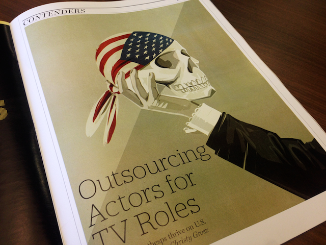
The Contenders portion of the magazine (awards content) is labeled with gold folios.

This checkerboard-like layout was created to highlight likely contenders in each awards category. It allows flexibility in the number of entries listed for each category, scale change within the imagery for visual interest, while providing the art dept. an easy-to-follow template for quick production.

Creative Director for all pages: Chris Mihal. Director of Photography: Bailey Franklin.